I love magic. I always have. And back in the day, I used to do my fair share of magic tricks for friends and family (I might even do some on stage at SMX Israel if I don’t chicken out). This is also exactly why Google + Auto Awesomeness was so exciting to me.
Not only do I love magic, I also love figuring magic out. I am not a “magic outer” by any means, and normally, I like to keep tricks to myself. But when I see the opportunity for a brand to capitalize on a social media tactic, you better believe I am going to share it with the universe!
The Trick: Magical Changing Twitter Pictures
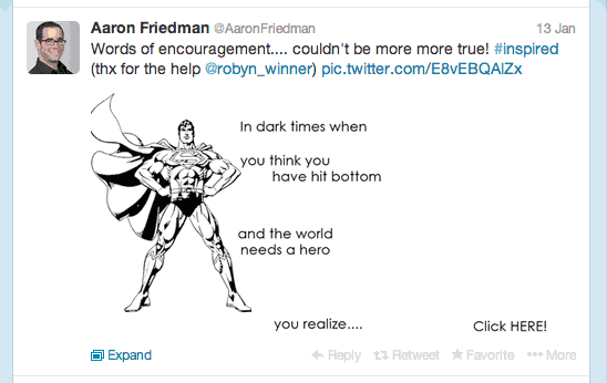
Earlier today, I saw this tweet go out with the attached image you see below:

The whole thing is a remarkable and inspiring work of art in and of itself. But it’s also a genius way to take advantage of a lesser known Twitter… “something” (I am not sure what to call it yet).
After a bit of thought on the mechanics, I got super excited, flagged down our super talented intern, Robyn, and enlisted her for a super important lunch time project, which she was equally as eager to get involved in.
The following tweets were produced here and here. (Note: I could not embed the tweets because it would ruin all the fun).
With one click, you can turn this inspiring image of superman:
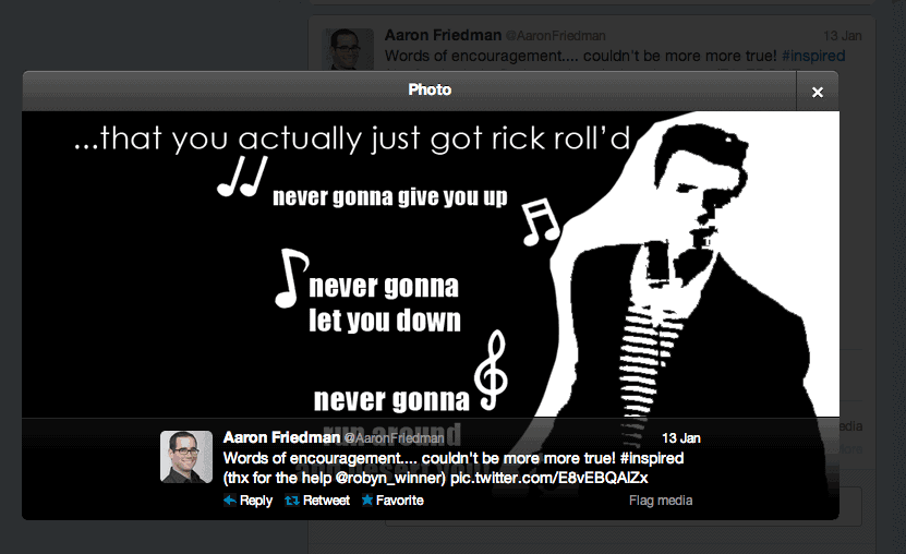
into this terrific Rick Roll:
Imagine the opportunity for a brand! Oreo Cookies (who kick butt on social anyway) doing something creative with their black and white cookies? Silhouettes of popular characters? Superheros changing into their other personas? Travel companies transporting you from your living room to an exotic landscape? The opportunities are endless. Imagine how engaging tweets like this would be.
So How Was It Done???
Of course I am going to tell you, but in order note to ruin the trick, I am also going to make you scroll down to learn 🙂
|
|
|
Scroll Down
|
|
|
|
|
|
|
|
|
Keep Scrolling
|
|
|
|
|
|
|
The Reveal
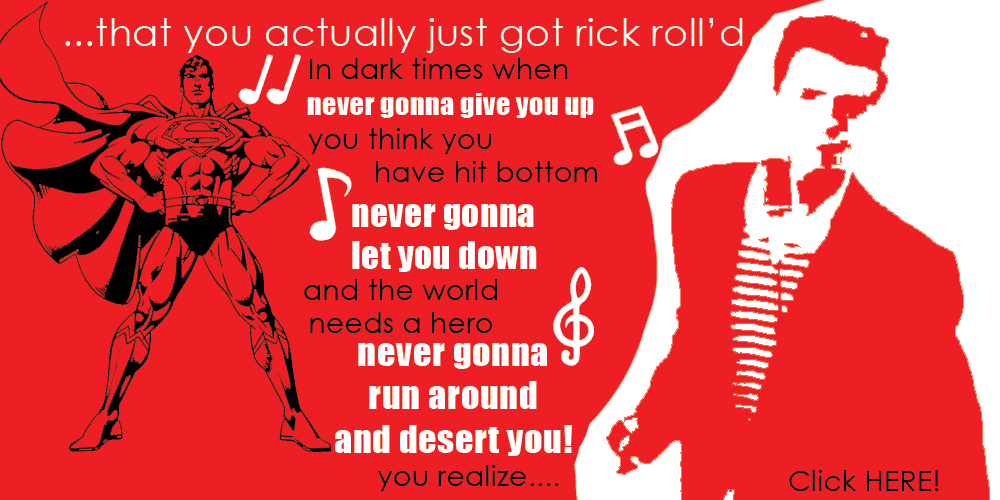
Ok, so here is the secret. They are in fact not 2 images. They are just one. Here is what it really looks like:
All we are doing here is taking advantage of a simple Twitter feature (flaw or bug or discrepancy…. still not sure what to call it). Twitter allows transparent backgrounds. But, by default, on the main Twitter platform, the image background is white, but when you click the image, the default image background is black. So if you are with me until now, look at the red above. When the final image is produced, it’s actually transparent, not red. When the image is opened, depending on the view, those transparent colors change, causing a different image to appear.
COOL HUH?!?!
Here are clear instructions:
Step 1: Create a black and white image you are proud of, only make sure all the white space is transparent. That way, when it shows up on the main Twitter screen, it will look white.
Step 2: Create a second image only inverse the colors. That way when the image is on the white background, the white is masked, and when its on the black background the black is masked causing a completely different image to appear.
Step 3: Make sure to save the file as a .PNG
Step 4: Share on Twitter.
And that’s it. Please let me know how you have managed to use this for you or your clients. The possibilities are endless.
(NOTE: After this post was written, we discovered that with the new Twitter layout, this may not work as well as planned. Although, in the fleeting moment of the tweet, it does work. So enjoy while you still can.)


